The Challenge
The objective of our redesign was to adequate their four websites to the accessibility guideline WCAG level AA, give the users a new and easier experience, allow them to create and buy wireless solutions online, and also create an easy to manage the website. Given the customer’s demographics, usability was of critical importance to the project’s success.
Strategy
I started the project by understanding, strategizing and formulating stakeholders and business needs on high-level requirements document. This document focused on describing the expected outcomes, and tactics to fulfill their needs given the constraints.
The document had sections like: Scope Statement, Project Purpose, Deliverables, Acceptance Criteria, Constraints, Mitigation, Requirements, and High-Level Functionalities description.
Discovery & Analysis
Given the project timeline, we’ve opted to follow a “Lean UX approach”. I performed basic research to identify main pain points and opportunities, which included an online survey, screen navigation recordings, stakeholders interview, analytics review, and content audit.
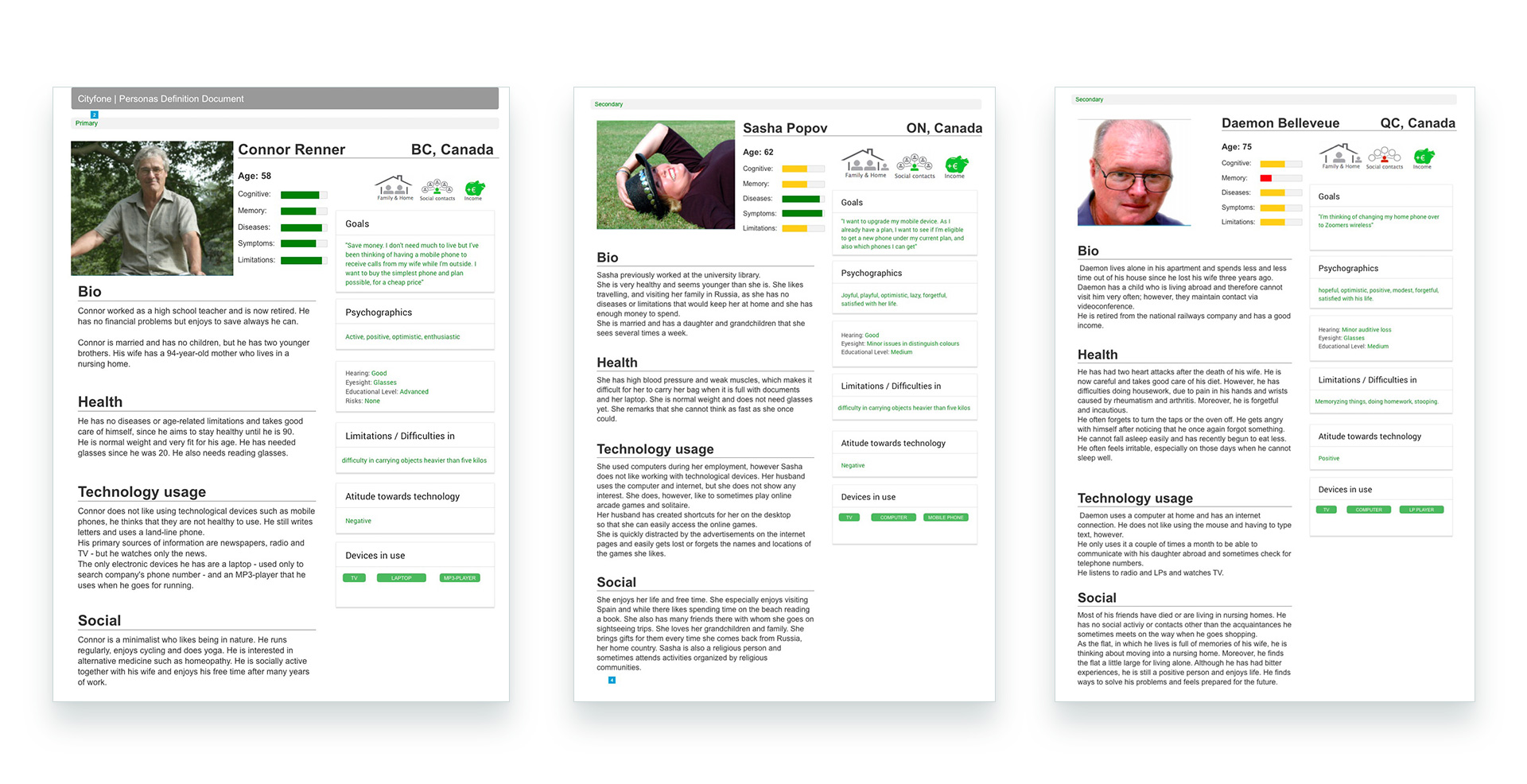
Personas
Information Architecture
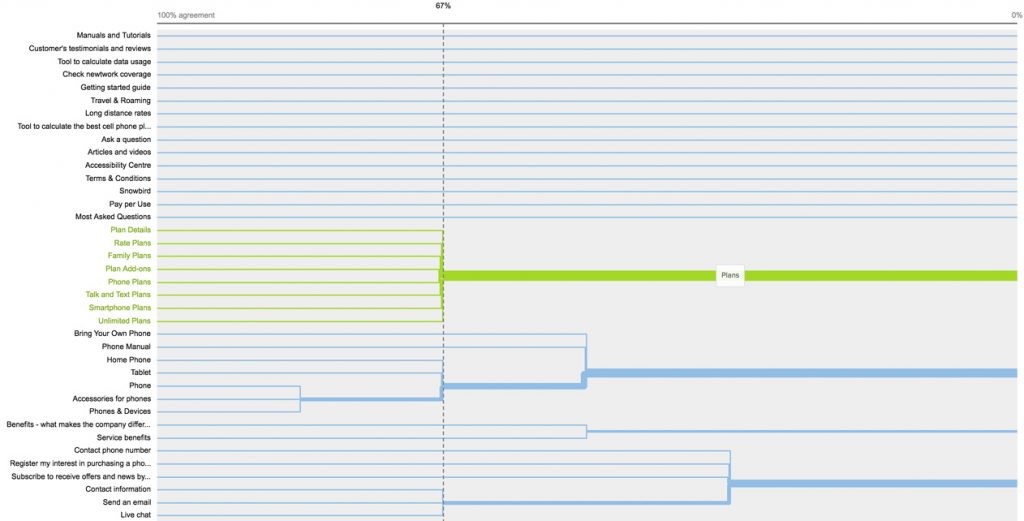
Taxonomy
Using card sorting, we categorized the information, as well as validated the taxonomy of the website and contents. I used the Optimal Workshop tool to facilitate the contribution by the team members and also to better analyze the data. My favorite method of analyzing is dendrogram, as it creates branches according to common patterns which facilitate a visual interpretation of the results.
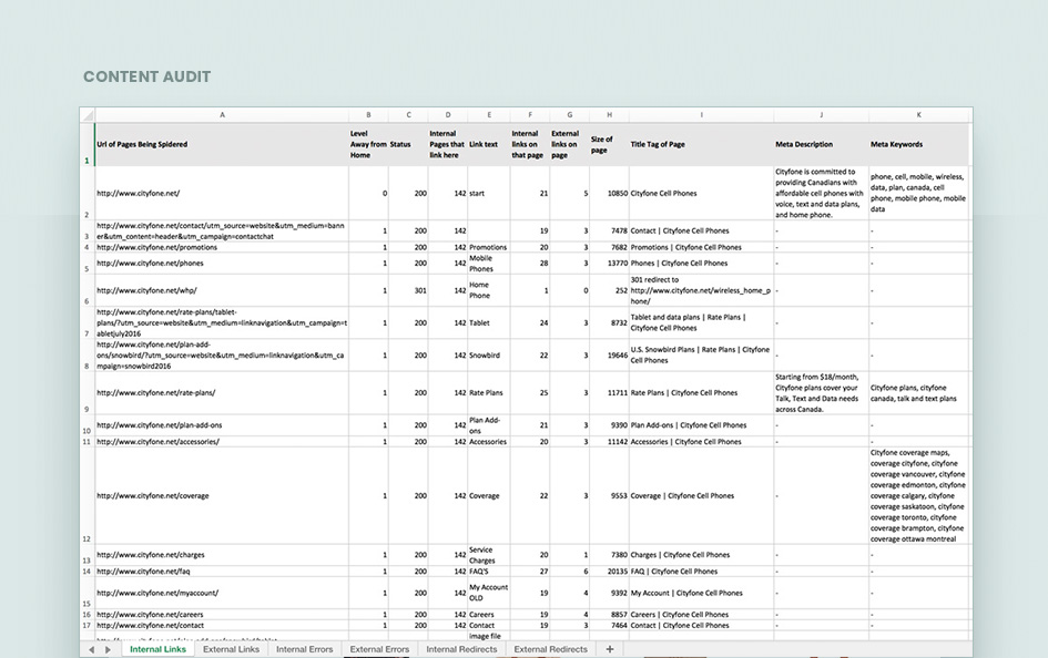
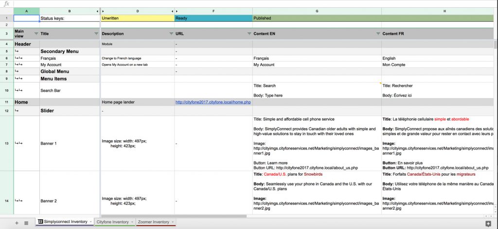
Content Inventory
The content inventory was created after having all pages structured, and it shows all content spots available on the website in a visual way that shows the hierarchies and details about each spot. It was broadly used by copywriting and marketing teams to populate and validate the website content, and by developers to perform the content inputs.
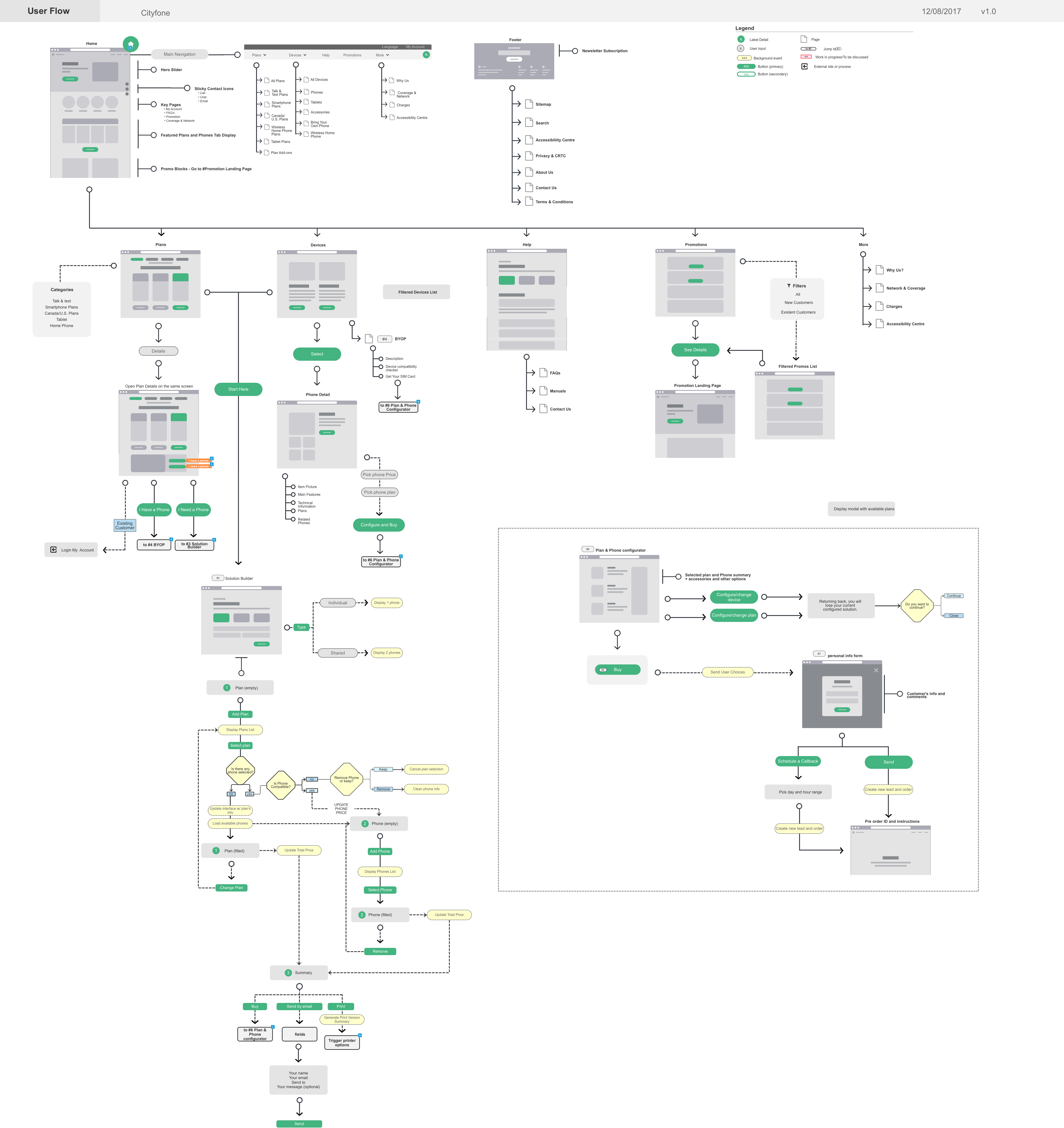
Sitemap, Pageflow, and Flowchart Diagram
As sitemap and site flow suffer many changes along the project, I created one online document using Axure RP, that is accessible through a link by everyone in the project. As all the information architecture decisions are reflected in one only document, it was easier to update and keep the whole team on the same page.
The document also included mini wireframes that facilitated the stakeholders understanding of the flow, as well as gave a better base for the developers start their part prior to the design delivery, saving time.
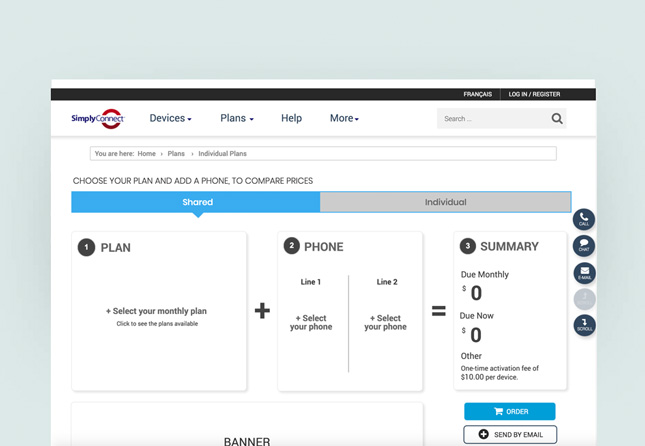
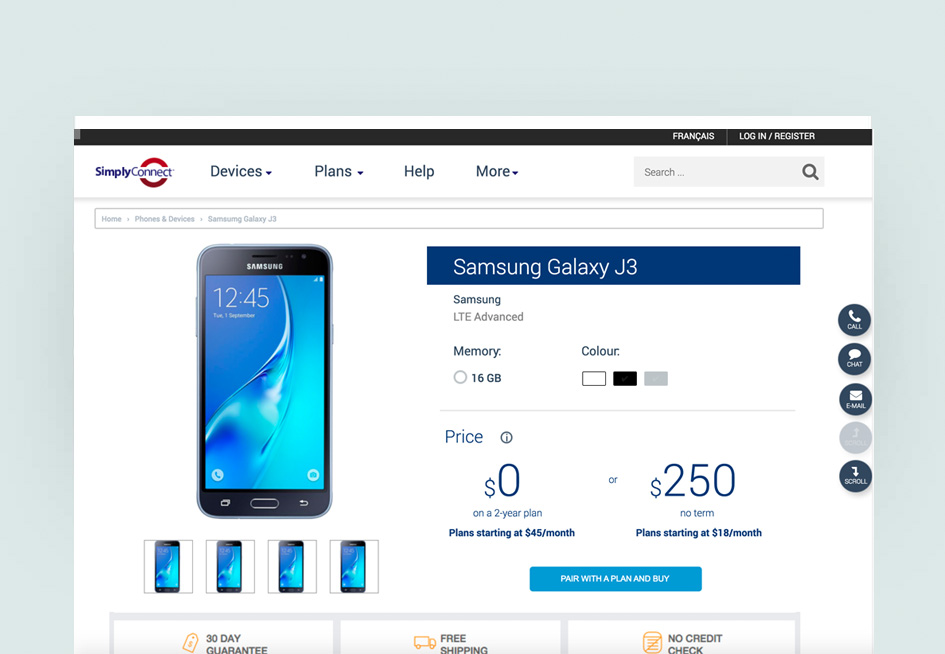
Wireframe & Prototype
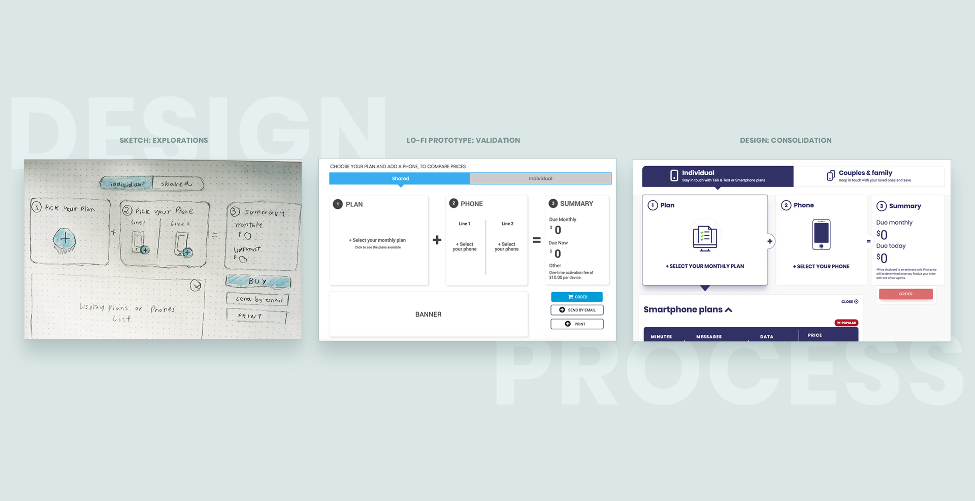
Created concept sketching to explore solutions using various tools from whiteboard and pen to Axure and Flinto, to conceptualize ideas and persuasively demonstrate solutions on presentations to stakeholders.


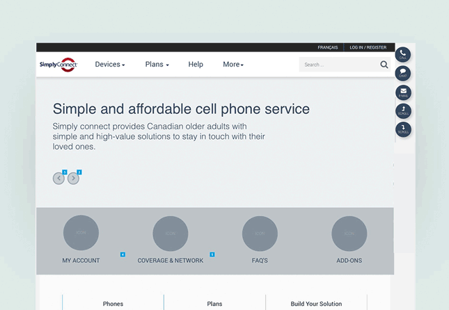
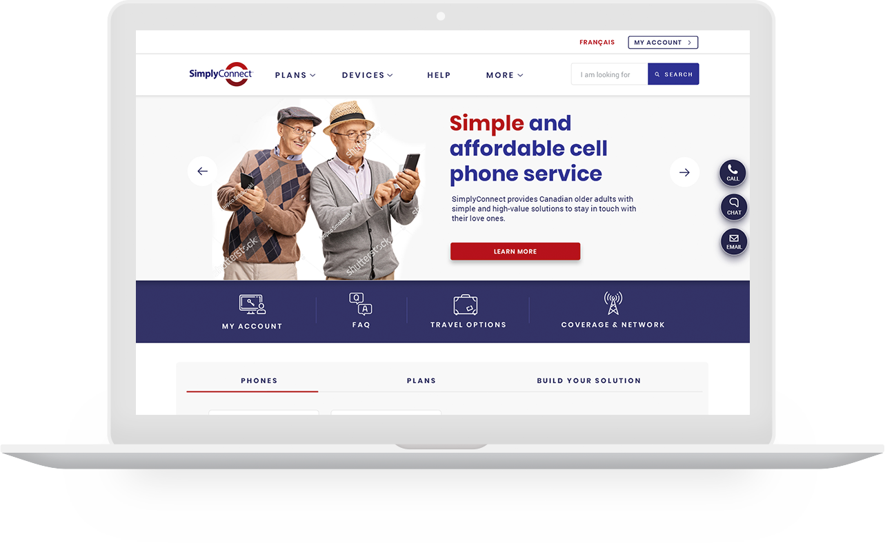
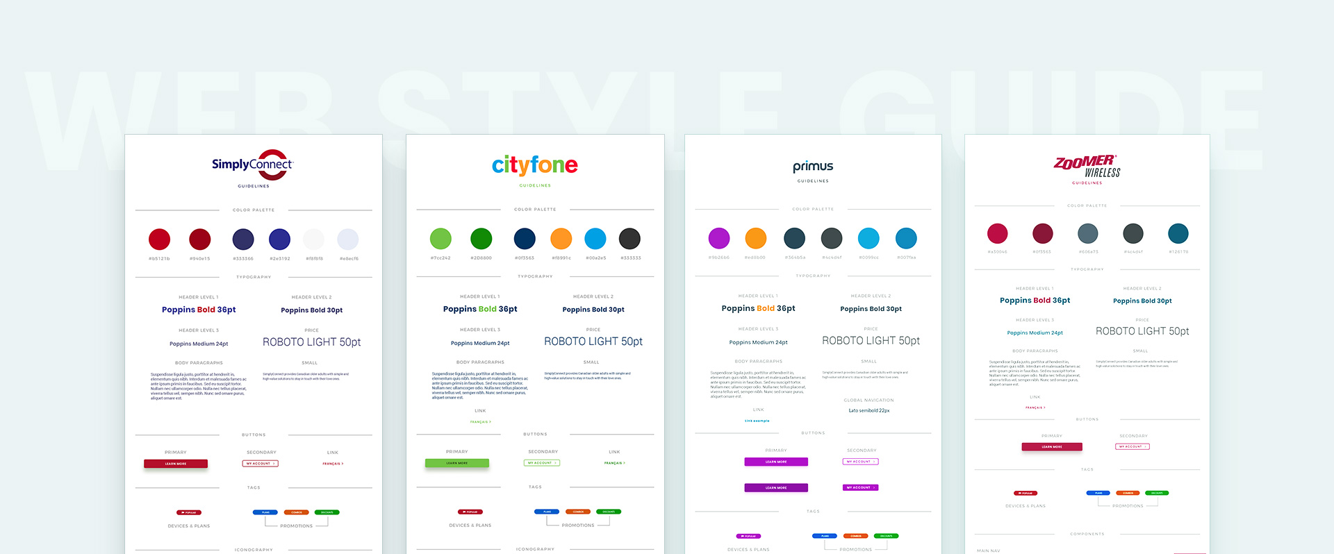
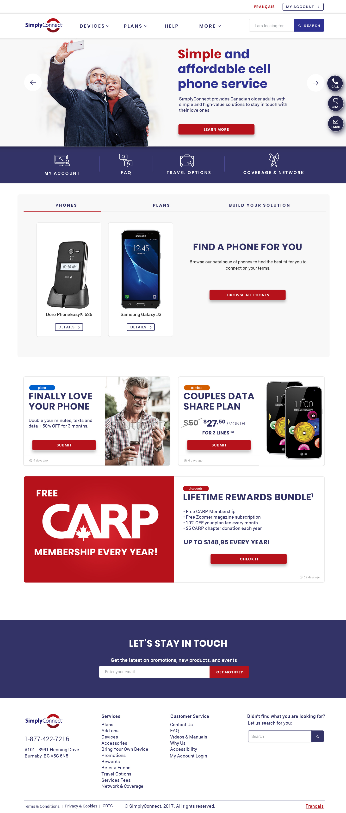
Visual Design
Created concept sketching to explore solutions using various tools from whiteboard and pen to Axure and Flinto, to conceptualize ideas and persuasively demonstrate solutions on presentations to stakeholders.
Reception
The project resulted in satisfied customers giving voluntary feedbacks on the NPS score research about how easy is to use the website, and find the information they need compared to other websites. The first online sale of the company came just a couple of hours after the launching and it follows growing day by day.